Should We Sample A Time Series More Frequently?
A decision often has to be made about whether an established time series, sampled at some rate, t, say, is to be sampled at a faster rate. For example, an official statistic is collected quarterly and a somebody (sometimes a national statistics agency or governmen) proposes to sample it monthly. In some situations it is easy to change sampling rates and can be achieved without too much fuss or cost. However, changing rates is rarely cost-free and, usually, high. Really, the pertinent question is "is it worth switching to the higher rate?" Will we gain useful information, that we did not obtain before, from my new faster-sampled time series?
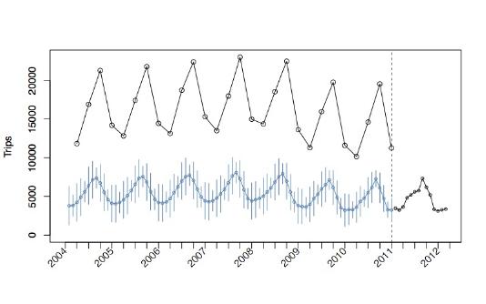
For example, the plot above shows a pot of the number of UK residents travelling abroad (ONS Statistics). The black circles before 2011 show quarterly estimates and after 2011 they are monthly (the blue time series are hindcasts making use of all the black information, but we will not pursue these further. More details can be found in the paper.)
Mathematically, switching to a fast rate cannot lead to a situation where you know less than you did before. In practice, information will be gained but, depending on the statistical properties of the series, you might not gain as much as you had hoped. In addition, if it was expensive to collect the faster rate data you might judge that moving to the fast rate had not been worthwhile. As a simple example, suppose that your time series looks very much like a pure oscillation with a frequency of one oscillation every five years. Then, a quarterly sampling would usually be adequate to acquire that information and little would be gained by moving to a faster sampling rate. However, this simple example is based on the assumption that you know what the true time series is. In practice, you don't. You do not know what you might find if you sample at the finer rate and you do not know until you do!
A way to understand these situations is via the spectrum otherwise known as the spectral density function. A spectrum plot depicts the contribution to variance at different frequencies (or, more precisely, the amount of variance present in a range of frequencies).
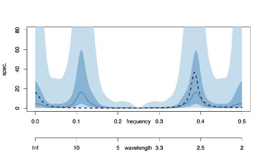
For example, examine the plot above. The range of frequencies in this spectrum ranges from zero to 0.5. The frequency of 0.5 is the highest frequency that can be observed in a series sampled at unit intervals and is known as the Nyquist frequency.
We suppose that the "true" time series is the one that has a spectrum depicted by the black dotted line in the figure. This spectrum codes power due to oscillations operating at about frequency 0.38 and also near zerofrequency (oscillations near 0.38 complete 8 oscillations every 21 tick marks, more or less. A zero frequency oscillation, unsurprisingly, is code for the overall vertical level).
Our observed series sees the "true" series at every other time point. So, if the "true" series ran at unit time intervals then our observed series would be collected at each even time unit (or each odd, but not both. For simplicity, let's assume the former). For our discussion the specific time unit (days, months, quarters) does notmatter: the same kind of behaviour happens whatever the unit.
What happens to the spectrum of an evenly-subsampled time series? The answer is that it is folded about the vertical line at 0.25 "back on itself" and the power combined. This is called aliasing. In other words: the new power, for the subsampled series, at a point w in (0, 0.25) is obtained by adding the power from the original series at w to the power from the original series at 0.25 + (0.25 - w) or, more simply, at 0.5 - w.
As mentioned above the Nyquist (highest) frequency in unit sampled data is 0.5. Now let's imagine we only consider our evenly-sampled data. Since the sampling rate is twice as slow as the "truth" the highest frequency is half that of the maximum unit-sampled Nyquist frequency, that is 0.25. The usual estimated spectrum for the observed data is shown as a blue solid line on the interval (0, 0.25). The blue colour blocks correspond to 50% and 90% credible intervals.
It is important to take note of the word "usual" in the previous paragraph. If you input evenly-spaced data into R's spectral estimation software, for example, then it would plot the spectral estimate on the range (0, 0.25).
However, the blue spectrum is also shown on the range (0, 0.5) and not (0, 0.25) and the part from (0.25, 0.5) looks to be the mirror image of that on (0, 0.25) reflecting in the vertical line positioned at frequency 0.25. Why is this?
The blue spectrum on the whole interval (0, 0.5) is our `best guess' of what the spectrum of the "true" unit-sampled data might look like BASED ON THE (EVENLY-SAMPLED) DATA THAT WE CURRENTLY HAVE ACCESS TO. On the "usual" spectrum the peak at about 0.12 for the evenly-spaced data might have arisen from a frequency of 0.12 in the "true" time series. However, IT MIGHT have also arisen from the frequency at 0.38 (and we can see from the "true" black spectrum that it is indeed 0.38 and not 0.12, but in practical situations we do not have access to the true spectrum).
So, the observed power in the estimated spectrum could come from the spectral peak at 0.38 OR it could have come from a "folded" version at 0.25 - (0.38 - 0.25) = 2x0.25 - 0.38 = 0.5 - 0.38 = 0.12. Indeed, the blue "possible" spectrum shows two peaks as 0.12 and 0.38 and, in the absence of any other information, both are potential generators of the folded spectrum of the observed data. At this stage, with just the evenly-spaced observed data, this is the best you can do.
At this point since the spectrum either side of 0.25 are reflections of one another they convey the same amount of information. This could indeed be the true position OR the true spectrum could be something else which adds together after reflect-add to make what looks like the left-hand side. How can we know?
To find out where the true power actually comes from we have to collect information on the higher frequencies (that evenly-spaced data won't give us access to). So, we could start collecting a few data points at a finer sampling grid, say, progressively collect observations at the unit time scale, for example. This is a switch in sample rate and is double the previous rate. In practice, increasing the sample rate might increase the costs.Such a scenario is likely in official statistics as each sample itself will cost but, also, there is likely to be at least a one-off extra cost in resourcing the change to sample at a faster rate.
Typically, depending on the costs, you might only commission a pilot study at the faster rate - collect at least until you are sure whether the new data is supplying valuable information. For example, you might sample faster, but if there is not much information at the higher frequencies then the new data might be information-poor and it is not worth continuing. Alternatively, you might not increase the sampling rate of the series you are interested in, but use a faster rate proxy along with a knowledge of measurement error between the proxy and the series that you really want to know about.
The plot above showed what could be achieved with 256 slow-sampled observations. The plot below shows what happens if you incorporate the information contained in an extra 16 unit-sampled observations.
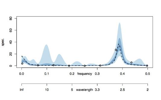
The combined spectrum snaps hard onto the true spectrum and the credible intervals there are also tight. It is interesting to note, though, the presence of 90% credible intervals around 0.12 where there had been power, although hardly any 50% credible interval (this is just saying that we're not absolutely sure that, with 16 new observations, that there isn't power at 0.12). However, anyone looking at this plot would surmise that the original `aliased' power at 0.12 had actually arisen from the 0.38 frequency observation in the "true" time series (which we've only now just seen, after adding the contribution of the new16 observations).
One might say, why don't we just estimate the spectrum from the 16 observations. This could be done and the plot belowshows various estimates.
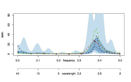
Our Bayesian estimate is in blue, as before (red is a kernel-smoothed periodogram, green is via AR estimation and the black circles are periodogram ordinates). Our blue solid line estimate isn't terrible but it is nowhere near as accurate as the spectral estimate obtained using both the 256 even samples and the 16 unit samples combined in the plot prior to the one above. Importantly, the credible intervals of the combined estimate are dramatically tighter. So, there is a real advantage in using ALL of the available data.
At heart our new method, regspec, enables spectral estimation from mixed rate data along with credible intervals. This then permits us to begin answering the question of whether it is worth collecting the faster rate data using information from all rates.
The full paper develops the idea further by integrating cost information into the decision process. In the future, we hope to look at how one might improve forecasting by using these kinds of methods. In particular, there are probably circumstances where using slower sampling rates might be better at predicting the future than faster ones, depending on the spectral content of the system.
This page reports joint work by myself, Ben Powell, Duncan Elliott of the ONS and Paul Smith of the University of Southampton described in the Series A paper.
|
